![[HTML] float 속성 & clear 속성 & overflow 속성](https://img1.daumcdn.net/thumb/R750x0/?scode=mtistory2&fname=https%3A%2F%2Fblog.kakaocdn.net%2Fdna%2FmJXnP%2Fbtrpz2Tfq4E%2FAAAAAAAAAAAAAAAAAAAAAAkkdzsEzJ6GnqMhwe51nHLIiPORfQdFhuLOg7bFK7XS%2Fimg.png%3Fcredential%3DyqXZFxpELC7KVnFOS48ylbz2pIh7yKj8%26expires%3D1769871599%26allow_ip%3D%26allow_referer%3D%26signature%3DTohkwv0eut8f%252B1yQI%252BAmTMP9ZDk%253D)
float 속성
HTML 요소가 주변의 다른 요소들과 자연스럽게 어울리도록 만들어준다. 레이아웃 작성 시 자주 사용된다.
<style>
	img { float: left; margin-right: 20px; }
</style>
clear 속성
float 속성이 적용된 이후 나타나는 요소들의 동작 조절.
컨테이너 요소에 float 속성이 적요되면 그 이후 등장하는 모든 요소들은 정확한 위치를 설정하기가 매우 힘들다.
<style>
      .left { background: #FF8C00; width: 150px; height: 50px; float: left; }
      .right { background: #9932CC; width: 150px; height: 50px; float: right; }
</style>
따라서 float 속성을 적용하고자 하는 요소가 모두 등장한 이후에 clear 속성을 사용하여, 이후에 등장하는 요소들이 더는 float 속성에 영향을 받지 않도록 설정해줘야 한다.
<style>
      .left { background: #FF8C00; width: 150px; height: 50px; float: left; }
      .right { background: #9932CC; width: 150px; height: 50px; float: right; }
      p { clear: both; }
</style>
overflow 속성
float 속성이 적용된 HTML 요소가 자신을 감싸고 있는 컨테이너 요소보다 크면, 해당 요소의 일부가 밖으로 흘러넘치게 된다. 이 때 overflow 속성값을 auto로 설정하면, 컨테이너 요소의 크기가 자동으로 내부의 요소를 감쌀 수 있을만큼 커지게 된다.
<style>
	div { border: 3px solid #73AD21; padding: 5px; }
	img { float: left; }
	.good { overflow: auto; }
</sytle>
1) overflow: visible;
- 기본값. 넘칠 경우 컨텐츠가 상자 밖으로 보여짐
2) overflow: hidden;
- 넘치는 부분은 잘려서 보이지 않음
3) overflow: scroll;
- 스크롤바가 추가되어 스크롤 가능
4) overflow: auto;
- 컨텐츠 양에 따라 스크롤바를 추가할지 자동으로 결정
5) overflow-x, overflow-y
- 가로, 세로 overflow를 각각 제어하고자 한다면 overflow-x 와 overflow-y를 사용
- 예/ overflow-x: scroll; overflow-y: hidden;
float 속성을 이용한 레이아웃
현재 웹 페이지의 레이아웃은 대부분 float 속성을 이용하여 작성되고 있다.
<style>
	div.page { border: 3px solid #CD5C5C; overflow: auto; }
	h2 { text-align: center; }
	header { border: 3px solid #FFD700; }
	nav { border: 3px solid #FF1493; width: 150px; float: left; }
	section { border: 3px solid #00BFFF; margin-left: 156px; }
	footer { border: 3px solid #00FA9A; }
</style>
예제 1
<!DOCTYPE html>
<html lang="ko">
<head>
<meta charset="UTF-8">
<title>CSS Float</title>
<style>
img {
float: left;
margin-right: 20px;
}
</style>
</head>
<body>
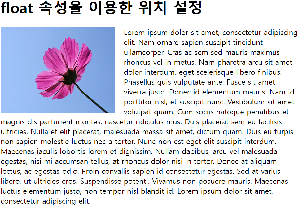
<h1>float 속성을 이용한 위치 설정</h1>
<p><img src="img_flower.png" alt="flower" width="245" height="185">
Lorem ipsum dolor sit amet, consectetur adipiscing elit. Nam ornare sapien suscipit tincidunt ullamcorper. Cras ac sem sed mauris maximus rhoncus vel in metus. Nam pharetra arcu sit amet dolor interdum, eget scelerisque libero finibus. Phasellus quis vulputate ante. Fusce sit amet viverra justo. Donec id elementum mauris. Nam id porttitor nisl, et suscipit nunc. Vestibulum sit amet volutpat quam. Cum sociis natoque penatibus et magnis dis parturient montes, nascetur ridiculus mus. Duis placerat sem eu facilisis ultricies.
Nulla et elit placerat, malesuada massa sit amet, dictum quam. Duis eu turpis non sapien molestie luctus nec a tortor. Nunc non est eget elit suscipit interdum. Maecenas iaculis lobortis lorem et dignissim. Nullam dapibus, arcu vel malesuada egestas, nisi mi accumsan tellus, at rhoncus dolor nisi in tortor. Donec at aliquam lectus, ac egestas odio. Proin convallis sapien id consectetur egestas. Sed at varius libero, ut ultricies eros. Suspendisse potenti. Vivamus non posuere mauris. Maecenas luctus elementum justo, non tempor nisl blandit id. Lorem ipsum dolor sit amet, consectetur adipiscing elit.</p>
</body>
</html>
예제 2
<!DOCTYPE html>
<html lang="ko">

<head>
	<meta charset="UTF-8">
	<title>CSS Float</title>
	<style>
		.left {
			background-color: #FF8C00;
			width: 150px;
			height: 50px;
			float: left;
		}
		.right {
			background-color: #9932CC;
			width: 150px;
			height: 50px;
			float: right;
		}
		p { clear: both; }
	</style>
</head>

<body>

	<h1>clear 속성을 이용한 위치 조정</h1>
	<div>
		<div class="left">왼쪽 끝에 위치하고 싶은 요소</div>
		<div class="right">오른쪽 끝에 위치하고 싶은 요소</div>
	</div>
	<p>이 글자를 아래쪽에 제대로 출력하고 싶어요!</p>

</body>

</html>

예제 3
<!DOCTYPE html>
<html lang="ko">
<head>
<meta charset="UTF-8">
<title>CSS Float</title>
<style>
div {
border: 3px solid #73AD21;
padding: 5px;
}
img { float: left; }
#second { clear: left; }
.good { overflow: auto; }
</style>
</head>
<body>
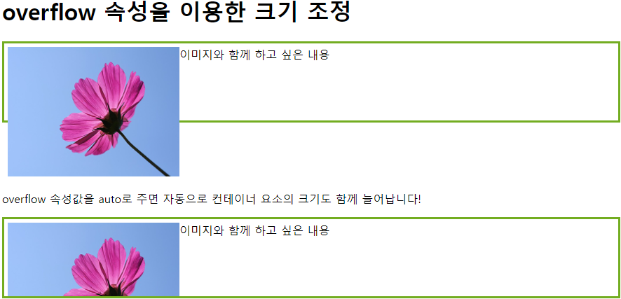
<h1>overflow 속성을 이용한 크기 조정</h1>
<div>이미지와 함께 하고 싶은 내용
<img src="img_flower.png" alt="flower" width="245" height="185">
</div>
<p id="second"><br>overflow 속성값을 auto로 주면 자동으로 컨테이너 요소의 크기도 함께 늘어납니다!</p>
<div class="good">이미지와 함께 하고 싶은 내용
<img src="img_flower.png" alt="flower" width="245" height="185">
</div>
</body>
</html>

예제 4
<!DOCTYPE html>
<html lang="ko">

<head>
	<meta charset="UTF-8">
	<title>CSS Float</title>
	<style>
		div {
			border: 3px solid #73AD21;
			padding: 5px;
			height:100px;
		}
		img { float: left; }
		#second { clear: left; }
		.good { overflow: hidden; }
	</style>
</head>

<body>

	<h1>overflow 속성을 이용한 크기 조정</h1>
	<div>이미지와 함께 하고 싶은 내용
		<img src="img_flower.png" alt="flower" width="245" height="185">
	</div>
	<p id="second"><br>overflow 속성값을 auto로 주면 자동으로 컨테이너 요소의 크기도 함께 늘어납니다!</p>
	<div class="good">이미지와 함께 하고 싶은 내용
		<img src="img_flower.png" alt="flower" width="245" height="185">
	</div>

</body>

</html>
예제 5
<!DOCTYPE html>
<html lang="ko">
<head>
<meta charset="UTF-8">
<title>CSS Float</title>
<style>
div.page {
border: 3px solid #CD5C5C;
overflow: auto;
}
h2 { text-align: center; }
header{ border: 3px solid #FFD700; }
nav {
border: 3px solid #FF1493;
width: 150px;
float: left;
}
section {
border: 3px solid #00BFFF;
margin-left: 156px;
}
footer{ border: 3px solid #00FA9A; }
</style>
</head>
<body>
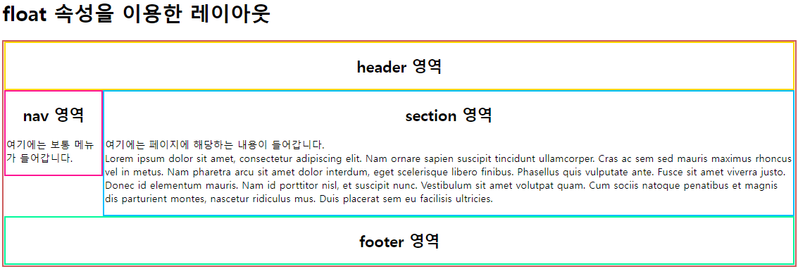
<h1>float 속성을 이용한 레이아웃</h1>
<div class="page">
<header>
<h2>header 영역</h2>
</header>
<nav>
<h2>nav 영역</h2>
<p>여기에는 보통 메뉴가 들어갑니다.</p>
</nav>
<section>
<h2>section 영역</h2>
<p>여기에는 페이지에 해당하는 내용이 들어갑니다.<br>
Lorem ipsum dolor sit amet, consectetur adipiscing elit. Nam ornare sapien suscipit tincidunt ullamcorper. Cras ac sem sed mauris maximus rhoncus vel in metus. Nam pharetra arcu sit amet dolor interdum, eget scelerisque libero finibus. Phasellus quis vulputate ante. Fusce sit amet viverra justo. Donec id elementum mauris. Nam id porttitor nisl, et suscipit nunc. Vestibulum sit amet volutpat quam. Cum sociis natoque penatibus et magnis dis parturient montes, nascetur ridiculus mus. Duis placerat sem eu facilisis ultricies.
</p>
</section>
<footer>
<h2>footer 영역</h2>
</footer>
</div>
</body>
</html>
'HTML > Day39' 카테고리의 다른 글
| [HTML] HTML 요소의 크기 (height & width) (0) | 2022.01.02 |
|---|---|
| [HTML] em과 rem (0) | 2022.01.02 |
| [HTML] 부정 선택자 (0) | 2022.01.02 |
| [HTML] 링크 선택자 (0) | 2022.01.02 |
| [HTML]문자 선택자 (0) | 2022.01.02 |